Your staff portal is now mobile-friendly
The website has been given a new design which works optimally on mobile devices.
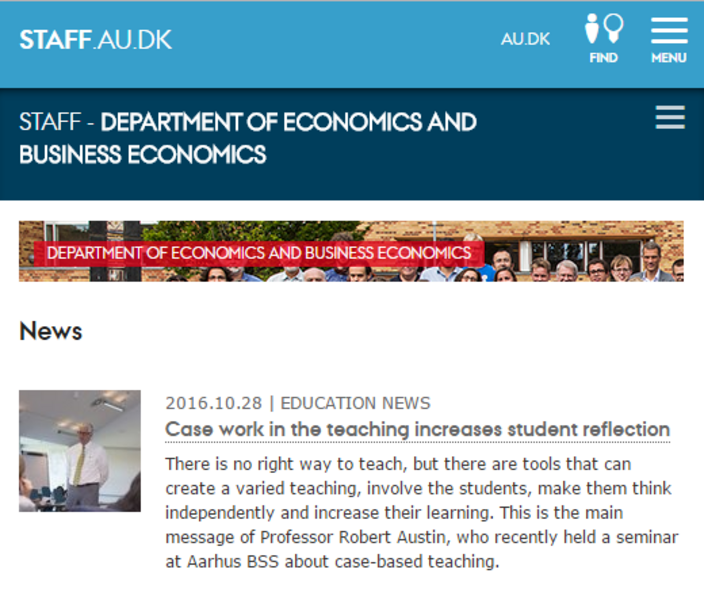
In 2016, AU has introduced a new responsive template type. This means that the content on the website automatically adapts to your screen size - e.g. on smartphones and tablets.
The template has just been changed for your staff portal, so that you can read news items and access practical information from the department on your mobile.
New icon provides quick access to systems
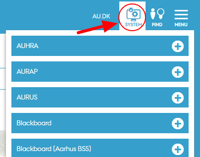
A new icon has been created on the top right-hand side of the department’s staff portal and gives you access to the most frequently used systems at AU. However, the icon is not displayed on a smartphone, as the systems are typically used when you are working on your computer. The icon is currently being developed for the English pages and will be included shortly.
Increased user-friendliness and new design options
The body text size has been increased to be more legible, and new elements have been developed for buttons and banners. These elements provide more options for using images and icons in web communication
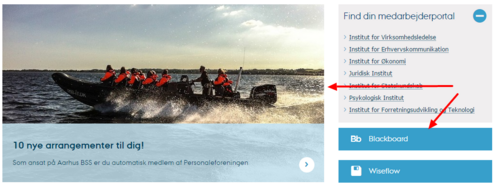
Example of the use of the new banner element and the new icon buttons.
Guidelines for web editors
Staff portal web editors can find the guidelines for the new design elements here:
- The new button element
- The new banner element (transparent text field)
- Banner element (full colour background)
If you would like a brush-up course on TYPO3 and on how to use the new elements, please contact Web Assistant Tenna Eliasen at eliasen@au.dk.